Monday, April 27, 2009
Pitbull Soundslide
Here's the Soundslide I made using the slides from my Pitbull presentation. It was a fairly simple process, only requiring me to change the format of my music and create pictures out of my slides.
What worked about this presentation is the same thing that worked during my Pitbull PowerPoint presentation, since it is practically identical. My favorite aspect was the backgrounds on the slides. Since I got to make my own slides, they were really appropriate for my musical artist, as well as creative and fun. I also liked how the Soundslide had a movie like quality. I think this works well with the music.
Something that didn't work quite as well with this project was the music. Though I was able edit a 30 second clip of a Pitbull song, I wish that I incorporated lyrics. I didn't realize that we were allowed to actually use voices in our music, and by the time I found out it was too late :(. The beat that I did use still sounds pretty good though.
The hardest thing I faced during this Soundslide was the music editing. I had never worked with any audio programs before, so it took me a long time to figure everything out. I ended up having to edit the same thing several times because I would forget to make them on a stereo track, or I would mess one thing up and have to start from scratch. It was frustrating but I'm glad that I now have a basic understanding of how to edit audio.
My favorite part, even though it was the hardest, was making a 30 second clip of a Pitbull song. Like I just mentioned, I think it's really cool that I now know how to work with audio.
If I had more time I would have tried to use Pitbull's voice in the 30 second loop. I know that it would've taken a long time to get everything to match up well, but it would've sounded really cool if I had enough time to do it.
Current Topic: Twitter
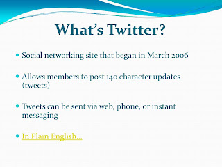
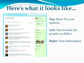
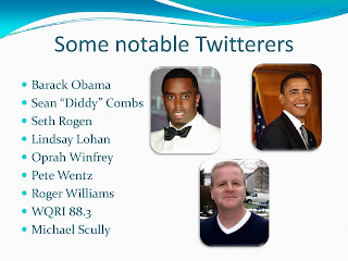
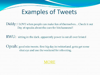
 For my current topic project I researched Twitter, a fairly new social networking web site. The sources I used include the Twitter web site, Wikipedia, The New York Times, and first person interviews. The information each of these sources contained allowed me to better understand what Twitter is and how people use it. I've used what I now know about Twitter to write an article on what exactly it is. But before I post my article, here's some preliminary information on the web site:
Twitter is a free social networking and microblogging website created in March 2006. It currently has about 12 million users who logged into the website upwards of 99 million times in March of 2009. People who have Twitter accounts use them to create 140 character or less posts or updates. They can also follow their friends or anyone who they are interested in to stay up-to-date on their posts.
The technology Twitter uses is a Ruby Red framework, which is an open source web application framework for the Ruby programming language. The posts also use hashtags (#) and at symbols (@) to help aid in searches or signify one person's direct update response to another.
As for finances, Fifty-seven million dollars of the business is owned by venture capitalists. CEO Evan Williams raised $22 million in venture capital. It's backed by business such as Union Square Ventures, Digital Garage, Spark Capital, and Bezos Expeditions. Also, Insitutional Venture Partners and Benchmark Capital just began backing Twitter this year, investing an addition $35 million into the web site. Williams said that the majority of this money will be kept in the bank in order to ensure the longevity of Twitter.
Stalkers everywhere rejoice! A new means for keeping tabs on your subjects has surfaced, and it's called Twitter. All you have to do is create an account and sit back while your homepage constantly refreshes with the latest updates from the people you've chosen to monitor.
Say, for example, you've decided to follow RWU sophomore Meagan Amylon. As of 11:07 p.m., on April 7th, you'd know that she "Went out to eat tonight. Ended up with food poisoning. Also, got a phone number from a man on the RIPTA and a new piercing."
Let's hope that no stalkers are actually obsessing over Amylon's, or anyone's, Twitter accounts. But with more than 14 million users, who logged into Twitter 99 million times just last month, it's safe to say that people are definitely interested in what this site and its users have to offer.
According to its web site, Twitter began in March of 2006 and is quickly gaining prominence in the online community. Similar to Facebook's status updates, this social-networking site allows its members to post updates containing up to 140 characters. These updates, referred to as tweets, appear to all of a particular users' followers, or people who subscribe to their account. According to the "About Twitter" web site, tweets can be sent via the web, instant messaging, or mobile texting.
Tweets usually detail someone's current activity, but there's no limit placed on their content or frequency.
"I probably update my status once a day," says Amylon. "I write about what I'm doing or some deep thought I've had… It's fun to come up with random witty comments as well."
Although average people constitute the majority of Twitter's users, they're not the only ones. Schools, clothing stores, politician and celebrities have Twitter accounts, too. Even RWU has its own account. The school uses it to, amongst other things, publicize upcoming speakers, summarize sporting events and share general news.
RWU followers could read that on March 11, at 11:16 a.m., the school updated that "Students raised $695 at Hunger Banquet which was sent to Oxfam International and the Bristol Good Neighbors Soup Kitchen. Good Job!!"
Tropical Gangsta, a women's boutique located in Newport, is just one of the many clothing stores that has its own site. This store uses its Twitter as a marketing tool, offering special sales and coupons to its followers.
Several politicians and celebrities have Twitter accounts as well. They're able to use it as a means to interact with their supporters, keeping them updated on their daily activities. President Barack Obama, blogger Mario Lavandeira, better known as Perez Hilton, actor Seth Rogen and rapper Sean "Diddy" Combs all stay in close contact with their fan followers.
Anyone following Obama knows that on Jan. 19, he was updating his Twitter account, "asking you to honor Dr. Martin Luther King Jr. by volunteering in your area. Visit http://USAservice.org or text SERVE to 56333 for info."
Twitter also has a feature that allows people to directly respond to others' tweets. A link to the right of the tweet automatically redirects users to their own update boxes, where they're prompted to type their responses.
For example, when Combs wrote on the evening of April 13th, "im tryin to stay off of twitter today because im sick but it keeps calling ME!!!!! lol," Rogen posted a direct response tweet.
"Diddy is off so should you.... Today is Twitter in 3D day," wrote Rogen. "Go to a bar shout what your doing you'll meet lots of people that way. LOCK IN!"
This site's popularity continues to increase. Amylon joined just a few weeks ago, in order to follow one of her favorite bands, and she's noticed the website's growth.
"When I first made a Twitter I couldn't find any friends on it," says Amylon. "But now it's getting more popular and I'm getting new follows everyday."
Why is this site growing so rapidly? The Twitter team believes that "simplicity has played an important role in Twitter's success. People are eager to connect with other people and Twitter makes that simple. Twitter asks one question, 'What are you doing?'"
For Amylon, it's even simpler. "It's fun, and another way to procrastinate."
Monday, April 20, 2009
Newsletter


Here's the newsletter that I created for Electronic Communications; I did it on the restaurant that I featured in my brochure, Iggy's Doughboys and Chowder House. For this project we had to take an Adobe InDesign newsletter template and replace its information with our own.
I think the color scheme of this newsletter worked really well. I was going to just leave the colors as they were in the template, but I took advantage of our ability to change them. I decided to use browns, sea-greens, and blues. These are the colors that I associate with sea glass, and since this is a restaurant on the beach I thought they'd be appropriate. I love these colors, and they really do look like sea glass!
Something that did not work as well as I would've liked was the title. After a lot of trying different fonts, I finally settled on a large bold one for the title, and then Impact for the address and phone number. It looks all right, but I think it could've looked better. I wish that InDesign allowed more freedom with text boxes, like QuarkXPress does.
The most difficult thing I encountered during this project was getting all of the fonts and colors to be consistent throughout the newsletter. I constantly had to click on all of the fonts to ensure that they were the same size, same style, and same type. It seemed like every time I thought I was done, I'd find ten more things that I'd have to fix. This is the same for the colors, as well. I had to go through and check all of the RGB measurements, so I could be sure that all of the browns, blues, and greens were the same throughout.
My favorite part of this project is probably the colors, as I mentioned before. I love how they look like sea glass... they're just really pretty and work really well for a restaurant on the beach!
If I had more time, I would've played around with the title more. I would've gone through more fonts and sizes to see if I could make the title tie in better with the address and phone number.
Thursday, April 16, 2009
Brochure


Here's my brochure for Iggy's Doughboys and Chowder House. For this assignment we had to choose a business/attraction that parents visiting RWU might want to visit. I chose this restaurant because its doughboys are hot and delicious and I think a lot of parents, if they had access to a yellow Iggy's brochure, would visit the Warwick location and agree with me.
I think the yellow background of this brochure worked really well. Professor O'Connell said that yellow would stick out in a sea of dark colored brochures, and I totally agree. Also, I picked a more subdued yellow that's supposed to represent the sand (since Iggy's is primarily a seafood restaurant, located on Oakland Beach). I think the yellow will grab people's attention, but is not too bright or offensive to their eyes.
Something that did not work as well as I would've liked was the items in the menu. Since Iggy's has several different food options, I wanted to include as many as possible. I think it would've been helpful and aesthetically pleasing if I had fewer items with brief descriptions. However, I thought it was important to include all of their different items.
My favorite part of this brochure was the inside background, a lighthouse at dusk. It's just a really pretty picture, and it ties well into the beach-y theme of Iggy's.
The most difficult aspect was also the inside background of the lighthouse. The picture was not large enough to fill the entire 8 1/2" x 11" paper, so I originally had to copy a sample of the background and paste it on the remaining space. This created a line across the paper and did not look professional. To fix this, I had to import the image of the lighthouse into PhotoShop, change the proportions, take a stamp of one of the colors, and color the empty space. It took a while, but once I was done it looked much better and the line no longer existed.
If I had more time, I think I would have added a little more decoration, especially to the front cover and to the borders of some of the pages. I tried to at first, but it looked a little busy and confusing. I would have like to experiment with adding subtle decorations that didn't overpower the text/pictures.
Still, I was really happy with the overall look of my brochure. It was a little bit difficult to figure out all of the measurements and folding, but once we did it as a class it was a lot of fun to make a professional brochure!
Thursday, April 2, 2009
Pitbull Again
 We got to experiment with QuarkXPress with this project. We had to make a poster advertising a CD release party for the same artist we featured in our PowerPoint presentation. For me, that artist was Pitbull.
I think the aspect of this poster that worked the best was the title, "Pitbull." I liked the font that I used, Impact, and I'm glad that I made it really large and yellow. I think it really grabs people's attention, which is what a poster is supposed to do.
My least favorite part of this poster is probably the pink burst that I placed at the bottom. I think it's a really cool idea, but for some reason it just did not seem to work that well. It seems almost out of place, and doesn't seem to fit with the poster's overall theme. However, it was a useful addition because it's attention grabbing.
The most difficult aspect of this project was just finding fonts, colors, and layouts that worked well together. I had a really hard time combining all of the elements into one fluid project, and it took me a long time to actually accomplish it. I think after some experimentation with the poster, however, I was able to achieve a poster with text and pictures that complemented each other.
My favorite part of this poster is the overlapping effect of the"@ RWU" on top of the "Pitbull" title. I love how QuarkXPress allows us to do a lot of layering, and I think that I took good advantage of this effect.
If I had more time, I would have worked more with the design, especially with shapes. I need a lot more practice with QuarkXPress, but I would have really liked to incorporate more artistic aspects into the poster. I hope to work with this program more often and improve my technical abilities, especially in regards to executing designs.
Subscribe to:
Comments (Atom)
