Monday, May 11, 2009

Bibi Cards


Here's one of the bibi cards that I had to re-create for my Electronic Communications class. My professor gave me a bibi card from a Scientific American magazine, and I had to create duplicates of it in QuarkXPress and Adobe InDesign. These images are of my Adobe InDesign card.

Something that worked really well in these bibi cards was the images. I think they look almost identical to the images in the original version of the bibi card. I was really glad that I was able to find the exact same pictures online, and then put them in the bibi card in the same positions--the angles and the sizes are both the same as the hard copy.

Something that did not work as well as I would've liked was the fonts. Actually, a lot of the fonts look nearly identical to the original, but others are a little off. The "40%" on the backside, for example, is a little different than the one on the real copy of the bibi card. I spent a lot of time looking through all the fonts, going through the Suitcase Fusion, and experimenting with different techniques and I was never able to match it perfectly. The one that I used in the end seemed to be the most similar to the real copy.

I am most proud of how the area where the reader (or potential subscriber) would fill in his/her information. In both InDesign and QuarkXPress this area looked very similar to the original. At first it was a little bit daunting, but after doing all the measurements and figuring out the spacing, it wasn't too difficult and it looked really good.

However, that was also the most difficult aspect of this project. I had to measure all of the lines, look for the closest-fitting font, and then do all of the spacing. It took a lot of time and it was really tedious. It was extremely frustrating trying to make everything in this section look like the original.

Finally, if I had more time, I think I would've gone through even more fonts in an attempt to get the perfect match. There were just so many different fonts, and so many different techniques that I could apply to them, that it would've taken several days to go through them all. Doing so would've been unrealistic, but it would've been nice if I could've found the exact match. Still, I'm really happy with the fonts and the overall look of my bibicards.

Personal Essay

Personal Essay Design Rationale

The post above this one contains my final project for my Electronic Communcations course. We had to create either a Soundslide or a video that showcased the majority of the techniques we've learned this semester. This project also had to explain one of our passions. For mine, I decided to do a Soundslide about my family's vacation home in Narragansett, Rhode Island.

Our beach house is in Breakwater Village, a small trailer park in Pt. Judith. I went through childhood and current photographs and identified 12-15 that I thought would be appropriate for this Soundslide. Most of them had to do with my sisters and me, surfing, and the location itself.

I then wrote a script for my Soundslide, which I recorded into GarageBand. Since I have a Mac with a built-in microphone, it was really convenient to record my voice in GarageBand. I then recorded some ambient sound of water lapping to serve as background audio. The sound of the water is not very loud, but that was my intention. I didn't want the water to overpower my voice, I just wanted it to be really subtle and relaxing, and I think I accomplished that.

After I had compiled all of my pictures and exported my audio into iTunes, I was able to create my Soundslide (which can be seen in the previous post). I wanted the pictures to correspond with what I was saying, and I think for the most part, they do.

My favorite part of this presentation is the pictures. I was really glad that I was able to find pictures from my childhood that matched my script, particularly the ones with my sisters and me. Since one of my main points about memories from Breakwater Village concerned my sisters, I thought it was really appropriate that I could include this pictures into my presentation.

Something that didn't work quite as well as I would've liked was the audio. Though I intentionally made the lapping water quiet, I think it could've been a little bit louder. Also, I was not very happy with the sound of my voice in this project. I don't know what it is about my voice-- I guess I'm just not accustomed to listening to my voice on recordings.

I'm most proud of how the audio and the images work together. I think the pictures correspond to what I'm saying in the audio, and this helps tell a story and makes my presentation more effective. Although I had some difficulty trying to figure out the timing, it ended up working fairly well.

The most difficult aspect of this project was, without a doubt, the audio. I had such a hard time recording my voice, I had to start over a million times. When I messed up I would still keep going, but I usually had to do it over again because my timing was always off. Once I finally did a good run through, I had to go through and edit out all the mistakes and make it sound like one fluid story, which was difficult as well. Then things only got more complicated when I had to add in the ambient background audio. In the end, however, I was pretty happy with the result.

If I had more time, I think I would've liked to elaborate on this project. I have so many pictures from Breakwater Village, and so many more things to say, that it would've been nice to be able to include them. I know that I could've made it five minutes long, but I didn't want to bore my viewers. I think I made it a good length; it's long enough to give people insight into my childhood and summer traditions, but not long enough to make them lose interest.

Though this project could get a little frustrating and overwhelming at times (like a lot of the projects in this class), I was really happy with the final product (also like a lot of the projects in this class!) I was really excited that I was able to use all the skills I've gained this semester in Electronic Communications to create a Soundslide about one of my passions.

Monday, May 4, 2009

Soundslide script

Here's the script for my final project in Electronic Communication.

Some of my earliest memories include running up and down a small, secluded beach with my three sisters. Tanned to a golden brown from the summer sun, we would wake up early to go boogie-boarding, skip lunch to build sandcastles and search for crabs, and play wiffle-ball until well after the sun had set.

We were at Breakwater Village in Point Judith, Rhode Island. The park where, decades earlier, our dad had spent his days in the same manner. It’s a small trailer park located on an even smaller beach, and it’s the place where my family has spent weekends in the summer since my great aunt and uncle bought the park in the 1950s.

I can remember my sisters and I would anxiously anticipate the three-hour car drive from our permanent home in Buxton, Maine to southern Rhode Island. Come Friday afternoon, we would have our bags packed and our snacks prepared as we frantically rushed our parents to do the same. Once they finally had, we’d all pile into our blue Town & Country van with our dog and commence our journey. After about an hour all the kids would be asleep, dreaming of the ocean and the warm sun that awaited our arrival.

Sadly, those days gradually ended as we got older and my sisters left for college. As the baby of the family I was the only one still available to accompany my parents to the beach. I started spending more time with my Breakwater friends, staying up late to play manhunt and huddle around bonfires on the beach.

It was around this time when I discovered another passion apart from Breakwater Village: surfing. Though I’d been introduced to it before, it wasn’t until this time that I became obsessed with it. Whenever there were waves, my friends and I would paddle out to a spot called the “K”. There, I collected many scars as a result of the hard rock bottom. But at the same time I also collected a lot of memories and formed a love for and a deeper connection with the ocean.

Nowadays, I still spend my summers in Breakwater village, though there have been some significant changes. Our once TV-free trailer has been replaced with a wi-fi accessible park model. Careless days spent splashing in the water have been taken over by long shifts in hot restaurants, serving clam cakes and chowder to visiting tourists. But that doesn’t mean my feelings for Breakwater have changed.

It’s still where my family gathers for functions. Sisters who have long since relocated to New Jersey, Florida, and northern Maine still find time to celebrate the 4th of July and birthdays in Pt. Judith. Our parents still make us hotdogs and potato salad for lunch, and we still spend some afternoons lazing on the beach, barefoot, tanned, and loving where we are.

Monday, April 27, 2009

Pitbull Soundslide


Here's the Soundslide I made using the slides from my Pitbull presentation. It was a fairly simple process, only requiring me to change the format of my music and create pictures out of my slides.

What worked about this presentation is the same thing that worked during my Pitbull PowerPoint presentation, since it is practically identical. My favorite aspect was the backgrounds on the slides. Since I got to make my own slides, they were really appropriate for my musical artist, as well as creative and fun. I also liked how the Soundslide had a movie like quality. I think this works well with the music.

Something that didn't work quite as well with this project was the music. Though I was able edit a 30 second clip of a Pitbull song, I wish that I incorporated lyrics. I didn't realize that we were allowed to actually use voices in our music, and by the time I found out it was too late :(. The beat that I did use still sounds pretty good though.

The hardest thing I faced during this Soundslide was the music editing. I had never worked with any audio programs before, so it took me a long time to figure everything out. I ended up having to edit the same thing several times because I would forget to make them on a stereo track, or I would mess one thing up and have to start from scratch. It was frustrating but I'm glad that I now have a basic understanding of how to edit audio.

My favorite part, even though it was the hardest, was making a 30 second clip of a Pitbull song. Like I just mentioned, I think it's really cool that I now know how to work with audio.

If I had more time I would have tried to use Pitbull's voice in the 30 second loop. I know that it would've taken a long time to get everything to match up well, but it would've sounded really cool if I had enough time to do it.

Current Topic: Twitter


For my current topic project I researched Twitter, a fairly new social networking web site. The sources I used include the Twitter web site, Wikipedia, The New York Times, and first person interviews. The information each of these sources contained allowed me to better understand what Twitter is and how people use it. I've used what I now know about Twitter to write an article on what exactly it is. But before I post my article, here's some preliminary information on the web site:

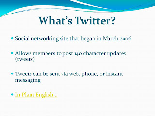
Twitter is a free social networking and microblogging website created in March 2006. It currently has about 12 million users who logged into the website upwards of 99 million times in March of 2009. People who have Twitter accounts use them to create 140 character or less posts or updates. They can also follow their friends or anyone who they are interested in to stay up-to-date on their posts.

The technology Twitter uses is a Ruby Red framework, which is an open source web application framework for the Ruby programming language. The posts also use hashtags (#) and at symbols (@) to help aid in searches or signify one person's direct update response to another.

As for finances, Fifty-seven million dollars of the business is owned by venture capitalists. CEO Evan Williams raised $22 million in venture capital. It's backed by business such as Union Square Ventures, Digital Garage, Spark Capital, and Bezos Expeditions. Also, Insitutional Venture Partners and Benchmark Capital just began backing Twitter this year, investing an addition $35 million into the web site. Williams said that the majority of this money will be kept in the bank in order to ensure the longevity of Twitter.
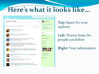
Twitter

Stalkers everywhere rejoice! A new means for keeping tabs on your subjects has surfaced, and it's called Twitter. All you have to do is create an account and sit back while your homepage constantly refreshes with the latest updates from the people you've chosen to monitor.

Say, for example, you've decided to follow RWU sophomore Meagan Amylon. As of 11:07 p.m., on April 7th, you'd know that she "Went out to eat tonight. Ended up with food poisoning. Also, got a phone number from a man on the RIPTA and a new piercing."

Let's hope that no stalkers are actually obsessing over Amylon's, or anyone's, Twitter accounts. But with more than 14 million users, who logged into Twitter 99 million times just last month, it's safe to say that people are definitely interested in what this site and its users have to offer.

According to its web site, Twitter began in March of 2006 and is quickly gaining prominence in the online community. Similar to Facebook's status updates, this social-networking site allows its members to post updates containing up to 140 characters. These updates, referred to as tweets, appear to all of a particular users' followers, or people who subscribe to their account. According to the "About Twitter" web site, tweets can be sent via the web, instant messaging, or mobile texting.

Tweets usually detail someone's current activity, but there's no limit placed on their content or frequency.

"I probably update my status once a day," says Amylon. "I write about what I'm doing or some deep thought I've had… It's fun to come up with random witty comments as well."

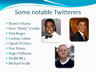
Although average people constitute the majority of Twitter's users, they're not the only ones. Schools, clothing stores, politician and celebrities have Twitter accounts, too. Even RWU has its own account. The school uses it to, amongst other things, publicize upcoming speakers, summarize sporting events and share general news.

RWU followers could read that on March 11, at 11:16 a.m., the school updated that "Students raised $695 at Hunger Banquet which was sent to Oxfam International and the Bristol Good Neighbors Soup Kitchen. Good Job!!"

Tropical Gangsta, a women's boutique located in Newport, is just one of the many clothing stores that has its own site. This store uses its Twitter as a marketing tool, offering special sales and coupons to its followers.

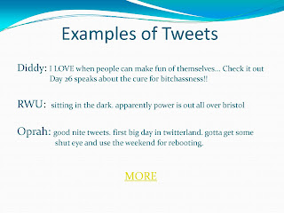
Several politicians and celebrities have Twitter accounts as well. They're able to use it as a means to interact with their supporters, keeping them updated on their daily activities. President Barack Obama, blogger Mario Lavandeira, better known as Perez Hilton, actor Seth Rogen and rapper Sean "Diddy" Combs all stay in close contact with their fan followers.

Anyone following Obama knows that on Jan. 19, he was updating his Twitter account, "asking you to honor Dr. Martin Luther King Jr. by volunteering in your area. Visit http://USAservice.org or text SERVE to 56333 for info."

Twitter also has a feature that allows people to directly respond to others' tweets. A link to the right of the tweet automatically redirects users to their own update boxes, where they're prompted to type their responses.

For example, when Combs wrote on the evening of April 13th, "im tryin to stay off of twitter today because im sick but it keeps calling ME!!!!! lol," Rogen posted a direct response tweet.

"Diddy is off so should you.... Today is Twitter in 3D day," wrote Rogen. "Go to a bar shout what your doing you'll meet lots of people that way. LOCK IN!"

This site's popularity continues to increase. Amylon joined just a few weeks ago, in order to follow one of her favorite bands, and she's noticed the website's growth.

"When I first made a Twitter I couldn't find any friends on it," says Amylon. "But now it's getting more popular and I'm getting new follows everyday."

Why is this site growing so rapidly? The Twitter team believes that "simplicity has played an important role in Twitter's success. People are eager to connect with other people and Twitter makes that simple. Twitter asks one question, 'What are you doing?'"

For Amylon, it's even simpler. "It's fun, and another way to procrastinate."

Monday, April 20, 2009

Newsletter


Here's the newsletter that I created for Electronic Communications; I did it on the restaurant that I featured in my brochure, Iggy's Doughboys and Chowder House. For this project we had to take an Adobe InDesign newsletter template and replace its information with our own.

I think the color scheme of this newsletter worked really well. I was going to just leave the colors as they were in the template, but I took advantage of our ability to change them. I decided to use browns, sea-greens, and blues. These are the colors that I associate with sea glass, and since this is a restaurant on the beach I thought they'd be appropriate. I love these colors, and they really do look like sea glass!

Something that did not work as well as I would've liked was the title. After a lot of trying different fonts, I finally settled on a large bold one for the title, and then Impact for the address and phone number. It looks all right, but I think it could've looked better. I wish that InDesign allowed more freedom with text boxes, like QuarkXPress does.

The most difficult thing I encountered during this project was getting all of the fonts and colors to be consistent throughout the newsletter. I constantly had to click on all of the fonts to ensure that they were the same size, same style, and same type. It seemed like every time I thought I was done, I'd find ten more things that I'd have to fix. This is the same for the colors, as well. I had to go through and check all of the RGB measurements, so I could be sure that all of the browns, blues, and greens were the same throughout.

My favorite part of this project is probably the colors, as I mentioned before. I love how they look like sea glass... they're just really pretty and work really well for a restaurant on the beach!

If I had more time, I would've played around with the title more. I would've gone through more fonts and sizes to see if I could make the title tie in better with the address and phone number.

Thursday, April 16, 2009

Brochure


Here's my brochure for Iggy's Doughboys and Chowder House. For this assignment we had to choose a business/attraction that parents visiting RWU might want to visit. I chose this restaurant because its doughboys are hot and delicious and I think a lot of parents, if they had access to a yellow Iggy's brochure, would visit the Warwick location and agree with me.

I think the yellow background of this brochure worked really well. Professor O'Connell said that yellow would stick out in a sea of dark colored brochures, and I totally agree. Also, I picked a more subdued yellow that's supposed to represent the sand (since Iggy's is primarily a seafood restaurant, located on Oakland Beach). I think the yellow will grab people's attention, but is not too bright or offensive to their eyes.

Something that did not work as well as I would've liked was the items in the menu. Since Iggy's has several different food options, I wanted to include as many as possible. I think it would've been helpful and aesthetically pleasing if I had fewer items with brief descriptions. However, I thought it was important to include all of their different items.

My favorite part of this brochure was the inside background, a lighthouse at dusk. It's just a really pretty picture, and it ties well into the beach-y theme of Iggy's.

The most difficult aspect was also the inside background of the lighthouse. The picture was not large enough to fill the entire 8 1/2" x 11" paper, so I originally had to copy a sample of the background and paste it on the remaining space. This created a line across the paper and did not look professional. To fix this, I had to import the image of the lighthouse into PhotoShop, change the proportions, take a stamp of one of the colors, and color the empty space. It took a while, but once I was done it looked much better and the line no longer existed.

If I had more time, I think I would have added a little more decoration, especially to the front cover and to the borders of some of the pages. I tried to at first, but it looked a little busy and confusing. I would have like to experiment with adding subtle decorations that didn't overpower the text/pictures.

Still, I was really happy with the overall look of my brochure. It was a little bit difficult to figure out all of the measurements and folding, but once we did it as a class it was a lot of fun to make a professional brochure!

Thursday, April 2, 2009

Pitbull Again

We got to experiment with QuarkXPress with this project. We had to make a poster advertising a CD release party for the same artist we featured in our PowerPoint presentation. For me, that artist was Pitbull.

I think the aspect of this poster that worked the best was the title, "Pitbull." I liked the font that I used, Impact, and I'm glad that I made it really large and yellow. I think it really grabs people's attention, which is what a poster is supposed to do.

My least favorite part of this poster is probably the pink burst that I placed at the bottom. I think it's a really cool idea, but for some reason it just did not seem to work that well. It seems almost out of place, and doesn't seem to fit with the poster's overall theme. However, it was a useful addition because it's attention grabbing.

The most difficult aspect of this project was just finding fonts, colors, and layouts that worked well together. I had a really hard time combining all of the elements into one fluid project, and it took me a long time to actually accomplish it. I think after some experimentation with the poster, however, I was able to achieve a poster with text and pictures that complemented each other.

My favorite part of this poster is the overlapping effect of the"@ RWU" on top of the "Pitbull" title. I love how QuarkXPress allows us to do a lot of layering, and I think that I took good advantage of this effect.

If I had more time, I would have worked more with the design, especially with shapes. I need a lot more practice with QuarkXPress, but I would have really liked to incorporate more artistic aspects into the poster. I hope to work with this program more often and improve my technical abilities, especially in regards to executing designs.

Thursday, March 26, 2009

Pitbull PowerPoint


These are all pictures from our last project in Electronic Communication, a Kiosk PowerPoint. We had to devote an entire PowerPoint presentation to an artist or band of our choice; I selected the rapper Pitbull. Professor O'Connell required us to have at least 5 slides and one song that ran throughout the entire presentation.

I think the best-executed aspect of this PowerPoint presentation was the backgrounds on the slides. In former work with PowerPoint, I became accustomed to using the pre-made backgrounds. With this project, however, I had to make my own original backgrounds. To do this, I searched for images of Pitbull, as well as his hometown of Miami, Florida. I then enlarged them, dragged them into the slides, and increased their transparency. This allowed for really appropriate, interesting, and creative slides instead of the generic PowerPoint ones.

The most difficult thing I encountered during this project was getting the slides and the music to run on their own. I first started this PowerPoint on my personal Mac, and I was unable to get the music to play and the timings I rehearsed to actually work. I couldn't figure it out on my computer, so I decided to wait until I could open the file on a computer in the North Campus Mac Lab. Once I did that, I was able to rehearse the timings and actually have them work. So, even though this was frustrating at first, I was able to solve the problem pretty simply just by using a different computer.

My favorite part of this project was definitely the audio portion of it. I had no idea that I could include music into PowerPoint presentations. I also loved that I could choose to make the music run by itself, and that it could go across all of the slides. I'm really glad that I learned about incorporating music into slides, and I plan on taking advantage of that knowledge the next time I have to make a PowerPoint presentation!

Finally, if I had more time, I think I would have experimented with animation more. I've never done anything other than slap a few pictures on a slide before, and this project made me realize that there are a lot of really fun effects in PowerPoint. If allotted more time I would definitely go back and apply some of the animation effects to my pictures and texts. Also, I think I would have added more slides-- it would've been nice to be able to display more information about Pitbull (because he's the best rapper ever!)

Monday, March 2, 2009

Contact Sheet


This assignment, the contact sheet, afforded me the opportunity to experiment with the general manipulation of images in Photoshop. With this project, I mostly gained experience in the resizing of images, although I also became more familiar with color and filters. Since my previous work in Photoshop concerned text primarily, I was excited to begin the contact sheet and work with the editing of images for the first time.

In the first set of photos, I had to change the resolution, or dots per inch (DPI) of a photo of gas barrels. To do this, I had to choose the “Image Size” option in Photoshop, de-select “Resample Image” and then change the resolution. Of the four pictures in the first row, there are resolutions of 72, 300, 600, and 1200. Though they may appear indiscernible from each other, at least at a size of 1 inch by 1.33 inches, their qualities do in fact vary.

For the format/mode portion of this assignment, I had to produce four copies of the same photograph in different color schemes. I had to transform a picture of a dancing couple to B&W, Duotone, Color RGB (for print), and Color CMYK (for web). This particular task required entering the “View” on the toolbar, scrolling to “Proof Setup,” and selecting the desired color.

The Orientation, Framing, and Content portions of this assignment were different, but all involved the changing of the image size. For the Orientation row, I had to resize the images; I made the height larger than the width for the Portrait, I made the width larger than the height for the Landscape, and I made the height and width equal for the Square. Framing and Content both involved resizing and cropping the images, so that some were close-up while others had wide angles, or that some were abstract while others were representational.

The final row consisted of applying different filters to a photo of a fire hydrant. I used Artistic Palette Knife, Drybrush, Crosshatch, and Journalistic filters.

The filters were definitely my favorite part of this contact sheet. I’m glad that I’m now capable of changing the quality, color, and size of photographs, but I think filtering is the coolest part. I really can’t think of a more eloquent way to word it: applying artistic and fun filters to photographs makes them look really cool, and I love it!

The most difficult aspect of this assignment was that, excluding the Resolution and Format/Mode portions, I had to figure out stuff by myself. Since I attended a journalism conference in San Diego and missed class on February 26th, I was not present when my instructor explained how to complete the other rows. Since I don’t have any previous experience with Photoshop, it took me a long time to do some (what I found later to be) fairly simple tasks. For example, I spent an hour or more searching for and researching (in books and online) for a button that magically changed a picture from Landscape to Portrait. It wasn’t until reading six or more online forums that I realized no such button existed, and that I had to manually change the height and widths.

Trying to figure out this assignment on my own may have been difficult, but it was also really rewarding. I’m proud that I was able to do research and experimentation to discover how to execute that last few portions of the contact sheet on my own.

If I had more time to complete this, I would have changed my Landscape portrait. Since I was not present in class when we learned how to do the Orientation, I was not aware of the exact sizes we were supposed to use. Although the width is larger than the height, the width is not 1.33 inches like it should've been. I definitely would have changed this if I had more time and knew earlier of the correct size. Also, I think I would have devoted even more attention to the filters. Looking back, I realize that there are so many different filters and filter settings that I could have tried. I have every intention to experiment with filters with personal work. That’s because, like I previously mentioned, they’re so cool!

Thursday, February 12, 2009

My Font Poem!


For our first Photoshop project, my classmates and I had to chose a poem and experiment with the different fonts available to us. For my poem, I chose a quote by Benjamin Franklin:

Hide not your talents
They for use were made
What's a sun-dial
In the shade?

I decided to use this poem because I've always loved Benjamin Franklin, I've always felt like we've had some kind of crazy connection. Ever since sixth grade, when I made a Benjamin Franklin puppet for a class, I've been fascinated with his life and accomplishments. I particularly like this quote because I think it has a great message; it encourages people to be proud of themselves and make use of their talents and abilities. Some times people prefer to hide or downplay their talents for fear of being considered arrogant, but I think this poem puts a positive light on self-confidence.

I used the following fonts in my project:
  • Onyx
  • Gill Sans Extra Bold
  • Zapfino
  • Candara
I thought Onyx worked well because it was a small and narrow font that reflected the word "hide." It makes it appear as if the word itself was trying to remain hidden in the piece. I used Gill Sans Extra Bold to emphasize the importance of "not," "use," and "shade." I made the font red for "not" to illustrate the severity of the word and its meaning. I also did gray shadowing with this font on "shade" to act as a literal interpretation of the word's definition. I really wanted those words to stand out, and I think that Gill Sans Extra Bold font helped me accomplish this. Zapfino is a very fancy and elegant font, which is appropriate for the words "talents" and "sun-dials." These words represent a person's skills and accomplishments, and Zapfino helps portray this idea. For the word "sun-dial," I changed the color to yellow in order to convey sunlight. Finally, I decided to use Candara for all of the other words because it seems like a somewhat understated font. It didn't detract from the other fonts, but it's still slightly decorative.

I arranged the words the way I did to place emphasize on what I deemed to be the most important words. I didn't want to stack the most powerful and significant words directly on top of each other. Instead, I alternated the lines in order to separate the main words, whose fonts I also increased.

Some of the problems I encountered include the shadowing I put on the word "shade." I had no idea how to make shadows, but I was really interested in executing that effect. I looked up the steps online, but was still a bit confused. After trying to decipher the instructions, I realized I needed some help from Professor O'Connell. She came over to provide some aid, and in addition to the online directions, I was able to figure out the technique and include shadowing in my project.

I am the most proud of the shadowing effect, because I did not think I would be capable of figuring it out. As I just explained, after some help from both my professor and the Internet, I was able to. I think this experience made me aware that I can navigate through and overcome tricky situations, and I'm extremely proud of this realization.

If I had more time, I think I would have worked more with the arrangement of the individual words. I maybe would have tried manipulating the words more and experimenting with the different types of effects that I could apply to them. It would have been fun to play around with everything that Photoshop has to offer. I'm looking forward to doing this with future assignments.

Monday, February 2, 2009

Hello!

Here's my first blog for my Electronic Communication course at Roger Williams University in Bristol, Rhode Island. Throughout the following semester I will be posting all of the projects I do for this class. These projects include, but are certainly not limited to, a QuarkXpress poster, an InDesign newsletter, and a Kiosk PowerPoint. Amongst other information, I'll include pictures of my work, descriptions of the challenges I faced while completing them, and the changes I would've made if allotted more time.

I'm new to the blogging world, so I definitely need to explore this website and see everything it's capable of doing! I'm excited to start experimenting with fonts, designs, pictures, audio, and video. I'm hopeful that this blog will transform into a professional-looking showcase of my work.